Objective
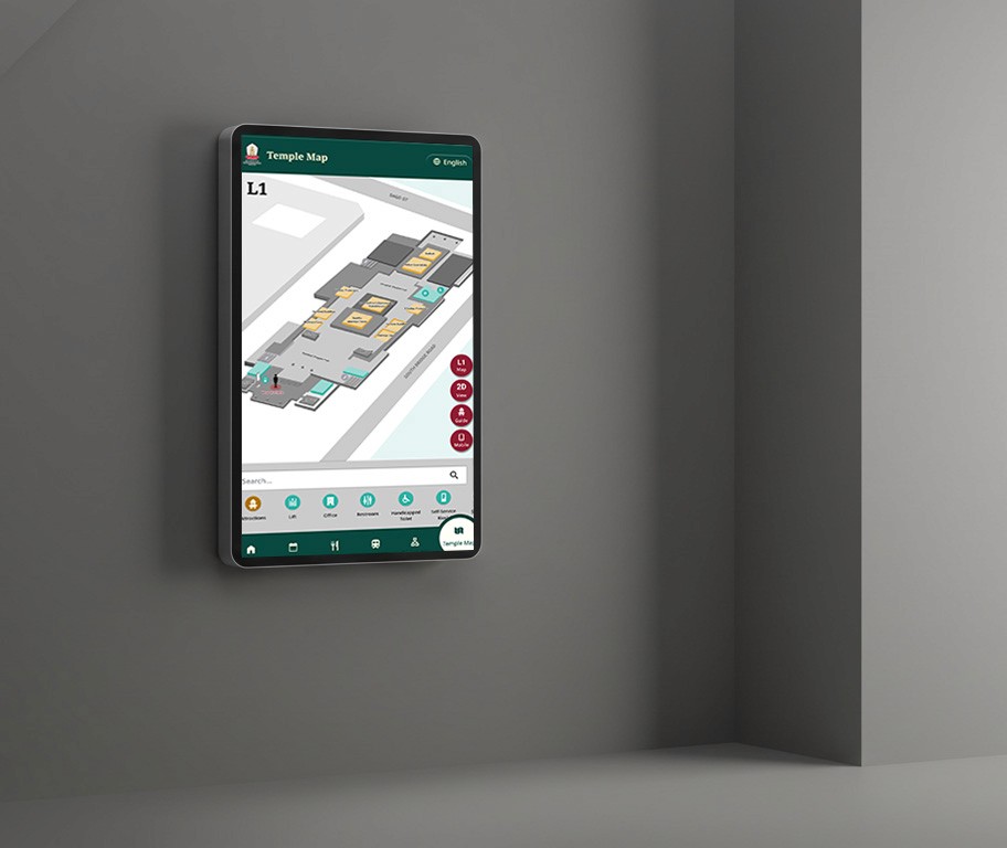
Buddha Tooth Relic Temple (BTRTS) is a remarkable Buddhist temple complex located in Singapore's Chinatown. While the temple had existing digital kiosks, these were limited to displaying static images and information, making it challenging for visitors to effectively navigate the temple's five floors and locate key facilities.
Our objective was to transform the existing static kiosks into an interactive wayfinding solution with multi-languages support, CMS backend that allows staff to manage and digital signage display for dining menu and announcements.
Design Approach
Before we kick off the designs, our team visited to Buddha Tooth Temple to observe the temple’s environment, studying current kiosks locations, current navigation issues and infrastructure requirements across all five floor.

One of our considerations included, visitors often struggled to remember directions after viewing the static maps on kiosks. This led to the solutions for us to implement the QR code feature that allows visitors to transfer the map and navigation to their mobile phones.

We find the high-level simple overview user journey for main actions they would use for kiosk and opportunities that we can apply:
The journey covers four main actions:
Browse Directory
Today's Event
Find Other Events and Location
Find Restaurant
Next step, we break down the functionalities and structured the sitemap of overview of our digital kiosk. Each section offers the functionalities for the user needs that we identified.

Design Mockups
Through a few design feedbacks sessions with stakeholders, we collectively agreed on a design color schemes and overall layout.


Backend Content Management System
Based on the features that we wanted to ha designed the CMS screens the for managing digital kiosk content across multiple screens. It allows admin and staff to easily update event schedules, location information, languages setting and users and kiosk management setting. Wayfinding and transit are created in backend and the features are not directly editable in the CMS.

Challenges
The primary challenge was working with stakeholders who were not tech-savvy or familiar with design tools like Figma. This required a different approach to communication and design presentation. I also had to prepare PowerPoint Presentation and physical documents that made the design process transparent and understandable.
What I learned
“Build the things that are flexible to adapt the change”
In the early CMS design, we catered fixed four languages. But the discussion shift to make the English and Chinese emerged as core languages and scalable for other languages. So I needed to revise the design for that flexibility in front end and backend. We have learned the critical importance of designing with flexibility in mind.